Navigating Occupancy Rates in CMBS
A Comprehensive Guide to Analyzing and Visualizing Occupancy Rates for CMBS Deals using Streamlit and ChatGPT
In today's commercial real estate landscape, fluctuations in occupancy rates have become an increasingly significant concern for investors and property owners. Drops in occupancy rates can not only affect the cash flow generated by a property, but also impact its overall value and the performance of the underlying CMBS deal. As a result, understanding the occupancy rates of properties in a CMBS transaction is critical for investors to accurately assess the risk and potential returns associated with their investments.
Occupancy rates serve as an essential measure for evaluating the performance of a CMBS deal, as they provide insights into the demand for rental spaces and the financial health of the underlying properties. In this analysis, we will focus on the 2020-BNK25 deal and delve into the process of calculating and analyzing its occupancy rates. By examining this key metric, we aim to uncover any noteworthy trends or patterns that may inform investment decisions and contribute to a deeper understanding of the factors driving the performance of this particular CMBS transaction.
If you haven’t already, please have a read through our post last week where we began exploring the use of ChatGPT in the CMBS space.
Let the Analysis Begin!
Oh wait, I guess we need to get some data first. But wait, didn’t we get property data last week and leave that in our count.co dashboard? We sure did! So, let’s start with that properties.csv file and see what ChatGPT can do for us.
Please respond as an expert in CMBS transactions. Analyzing them, investing in them and writing research on them. You are also an expert in Python and Streamlit. Having had built an award winning visualization tool for the CMBS market. First question, how would you go about calculating occupancy rates in the CMBS market
Chat GPT responded with some basic stuff, which made me believe it is still on the right track:
Gather the data: First, collect the necessary data on the underlying properties in the CMBS pool. This information can be found in the deal documentation, servicer reports, and other data sources such as Trepp, Bloomberg, or Intex. The data should include details on the individual properties, such as property type, square footage, number of units, lease expirations, and occupancy status.
Filter the relevant properties: Depending on the focus of your analysis, you may need to filter the properties based on property type, location, or other criteria relevant to your research.
Calculate individual property occupancy rates: For each property in the filtered data set, calculate the occupancy rate as follows:
For properties with square footage (e.g., office, retail, industrial), divide the total leased square footage by the total rentable square footage.
For properties with units (e.g., multifamily, hotels), divide the total number of occupied units by the total number of available units.
Calculate the weighted average occupancy rate: To account for the different sizes and values of properties in the CMBS pool, calculate the weighted average occupancy rate by using the property's loan balance or notional value as the weighting factor:
Weighted Occupancy Rate = (Σ(Property Occupancy Rate * Property Loan Balance)) / (Σ Property Loan Balance)
Visualize the results: Utilize Python and Streamlit to create interactive visualizations that help users explore the occupancy rates of the properties in the CMBS pool. You can create charts such as bar plots, heatmaps, or geographical maps to display the occupancy rates and allow users to filter and analyze the data.
Hey, it even remembers that I like to use Streamlit. Or maybe it is the one that likes Streamlit? Unclear 😄 And if you remember from last week, we pasted in some sample data from the Edgar file and this time around, I am going to ask for something a little more detailed in return.
It once again created a dashboard for me and showed me how to go about making sure the right pip packages were installed and how to go about running it. Now, I ran the first version and it had made a couple of noticeable mistakes.
def calculate_occupancy_rate(row):
    if row['NETRENTABLESQUAREFEETNUMBER']:
        return row['NETRENTABLESQUAREFEETSECURITIZATIONNUMBER'] / row['NETRENTABLESQUAREFEETNUMBER']
    elif row['UNITSBEDSROOMSNUMBER']:
        return row['PHYSICALOCCUPANCYSECURITIZATIONPERCENTAGE'] / 100
    else:
        return None
Now, cool that it is looking at both occupancy by Unit Number and by Square Footage, however, it seems to have selected an incorrect field in the denominator in both cases. Good news is, and I am not entirely sure how it missed this, but, the Occupancy Percentage is reported in the Edgar data. So, I asked ChatGPT to update to use that field, and I gave it a little info too:
Please update the calculate_occupancy_rate method to use the PHYSICALOCCUPANCYSECURITIZATIONPERCENTAGE field which represents the occupancy rate for a given property. Please note, I noticed that sometimes the rate is in decimal format (ie. 0.80) and sometimes it is in whole number form (80). Can you make sure it always comes out decimal?
And it came back with the following code, which I think will work fine.
def calculate_occupancy_rate(row):
    if row['PHYSICALOCCUPANCYSECURITIZATIONPERCENTAGE']:
        fOccupancy = float(row['PHYSICALOCCUPANCYSECURITIZATIONPERCENTAGE'])
        if fOccupancy > 1:
            return fOccupancy / 100
        else:
            return fOccupancy
    else:
        return None
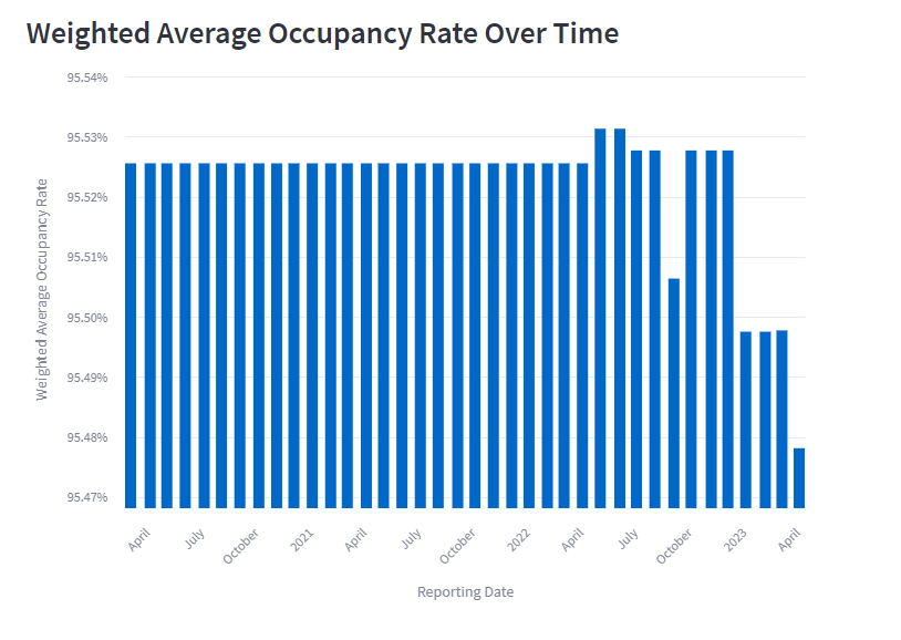
So what do we receive in return? I'll spare you the details of the initial Streamlit code it generated (you can check it out later... link in the Summary), but after a bit of fine-tuning, we arrive at the following:
So, for this specific deal, we observe a slight decrease in the overall occupancy rate.
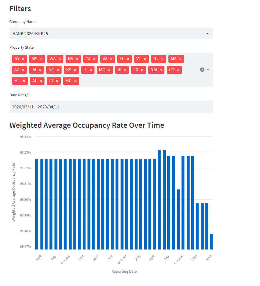
Curious to explore the data across different date ranges and by state, I asked ChatGPT to add a filter for State and incorporate a date range selection. Here's what it came up with:
This implementation may not be overly sophisticated, but it effectively uses a select box for the deal (or in this case, Company Name) and creates a multiselect from the unique States in the properties file. While I attempted to examine the States more closely, it proved to be a challenging way to pinpoint outliers. Perhaps there's a more effective way to visualize this data to identify outliers, such as a bubble chart or multiple lines? I'd love to hear your thoughts in the comments.
Occupancy Rates by Vintage
Now, let's shift our focus to something even more interesting: analyzing deals within a specific vintage. I'm eager to see how one deal compares to others, so let's examine the 25th, 50th, and 75th percentile weighted average occupancy rates for a given deal within its vintage:
Okay - new question for you. Let's say I have a file with a subset of the columns of property data:
[ COMPANY_NAME, PHYSICALOCCUPANCYSECURITIZATIONPERCENTAGE, MOST_RECENT_VALUE, PROPERTYSTATE, REPORTINGPERIODENDDATE ]
I want to show a line chart with weighted occupancy % (like we calculated before) on the left and REPORTINGPERIODENDDATE on the x I would like the following series:
- One line with just BANK 2020-BANK25 (solid line - black)
- One line with the 25th percentile weighted occupancy for all deals in the file (dotted line - grey)
- One line with the 50th percentile weighted occupancy for all deals in the file (dotted line - grey)
- One line with the 75th percentile weighted occupancy for all deals in the file (dotted line - grey)
Investigating the occupancy rates for one deal in a given vintage and comparing it to the 25th, 50th, and 75th percentile weighted average occupancy rates for all deals in the vintage can provide valuable insights into the deal's performance relative to its peers. Comparing a specific deal's occupancy rate to the quartile benchmarks helps to identify its position within the vintage and determine whether it is underperforming, outperforming, or in line with the rest of the market. This analysis can be crucial for investors when making decisions about their portfolio, as it can highlight potential risks or opportunities in the specific deal and inform strategic choices, such as rebalancing, monitoring or further due diligence on the underlying properties.
Of course, to do this, we needed a little more data. The guys at DealCharts had provided a great Count.co dashboard for the BANK2020 deal, however, I needed to call in a favor and get access to occupancy data for all vintages of active deals. If you are interested in having access to all, or some subset of CMBS data derived from Edgar, please do reach out to them.
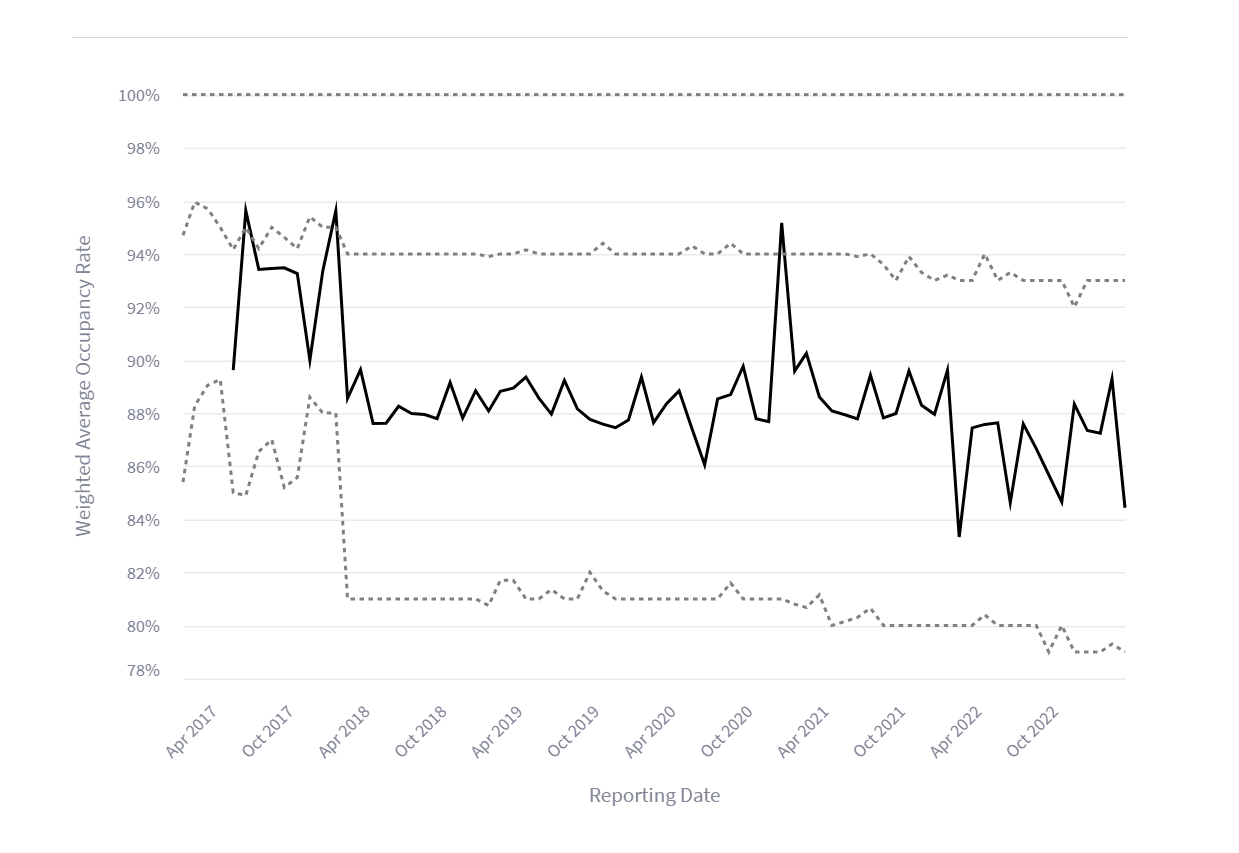
So, what did ChatGPT come up with? The initial version of code it presented was simply a standalone chart of the BANK 2017-BNK5 deal as seen below:
I had to assist with cleaning up the axis labels and setting the min/max on the Y-axis to zoom in on this specific area, much like we did in the single deal analysis. But overall, the result was about 90% accurate.
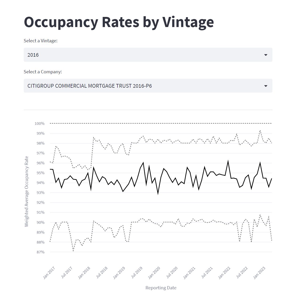
Next up, I implemented a couple of dropdowns to filter by Vintage and Deal (still referred to as Company, largely because the CSV has COMPANY_NAME) and set up the chart to automatically update based on the selected filters.
It's quite impressive, actually. I managed to accomplish all this in just an hour or so, and while I understand that this is still relatively basic, I continue to be amazed by the potential of having a partner like ChatGPT by my side to help build tools like this.
I've included a screenshot below, but I've also deployed the code to Streamlit for you to interact with and explore: CMBS Occupancy Rate - Streamlit App
Summary
I am continually impressed by how useful a tool ChatGPT can be if you know how to ask it the right questions. Throughout this post, we've explored the process of calculating and analyzing occupancy rates for the BANK-BNK25 deal using ChatGPT and Streamlit. From data cleaning and preparation to creating an interactive visualization, these tools have proven invaluable in providing crucial insights into the performance of the CMBS deal. We then added the ability to compare a single deals occupancy rates with the 25th, 50th, and 75th percentile rates for all conduit deals within the a given vintage vintage.
As technology continues to advance, the use of AI-driven tools like ChatGPT and Streamlit in Commercial Real Estate analysis will become increasingly prevalent. By embracing these tools, investors and analysts can gain a competitive edge in the market and make more informed decisions. We hope this post has inspired you to explore the potential of these tools in your own work, and we look forward to sharing more insights and applications in the world of Commercial Real Estate investing.
Remember, if you want to play around with the Streamlit app yourself, it can be found here:
CMBS Occupancy Rate - Streamlit App
If you are interested in the code from this post, just click on the little github link in the top right of the Streamlit App above. 99% of the code in that file was generated by ChatGPT!
Keep prompting!


